Jetpack Compose Navigation’s default fade in/out animation is a solid starting point, but let’s explore some ways to elevate the user experience by implementing more engaging transitions!
Have you ever admired the smooth slide-in and slide-out animations used for navigation in iOS apps? The good news is, achieving a similar effect in Jetpack Compose is quite straightforward! In this tutorial, we’ll leverage the power of Jetpack Compose Navigation and combine it with our existing Room database example to create a polished navigation experience with delightful animations.
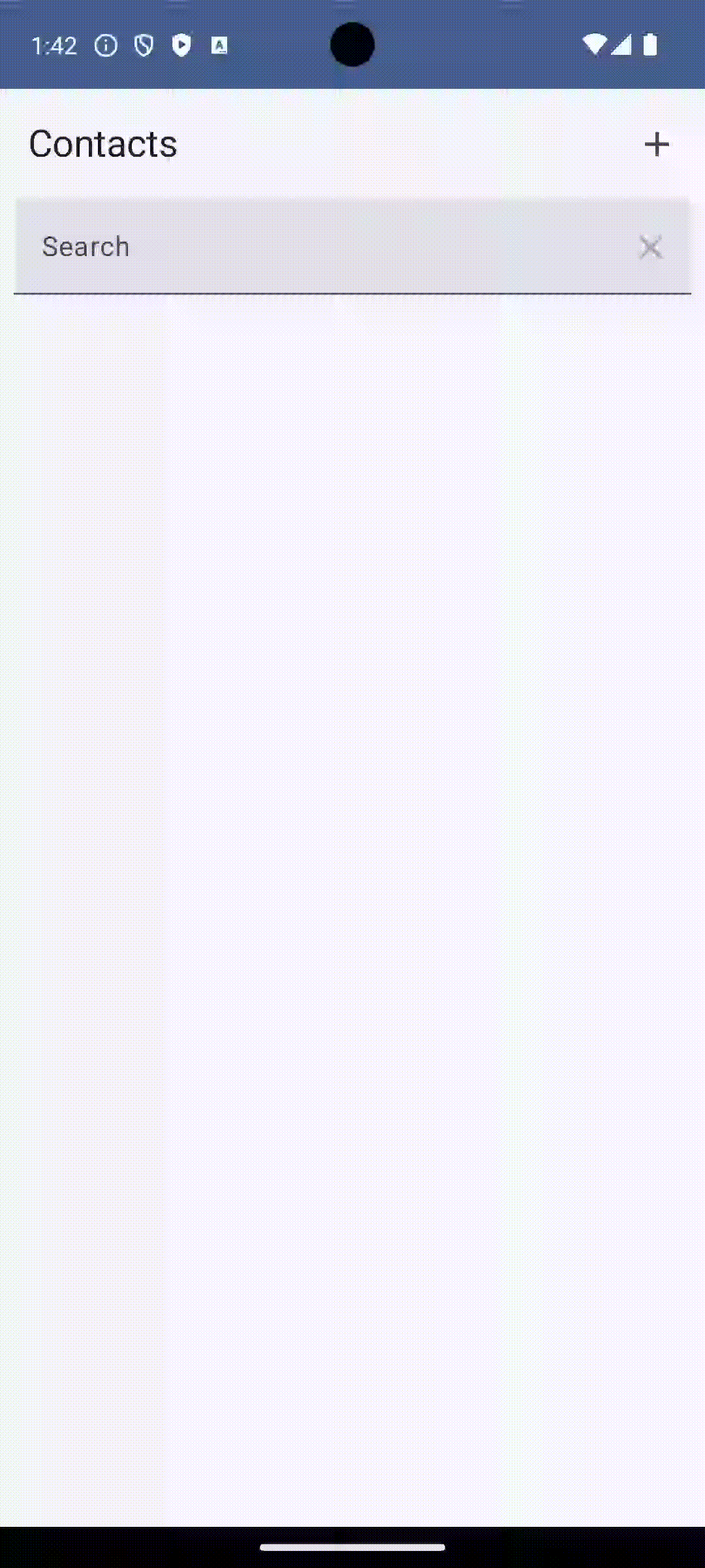
This is a default animation
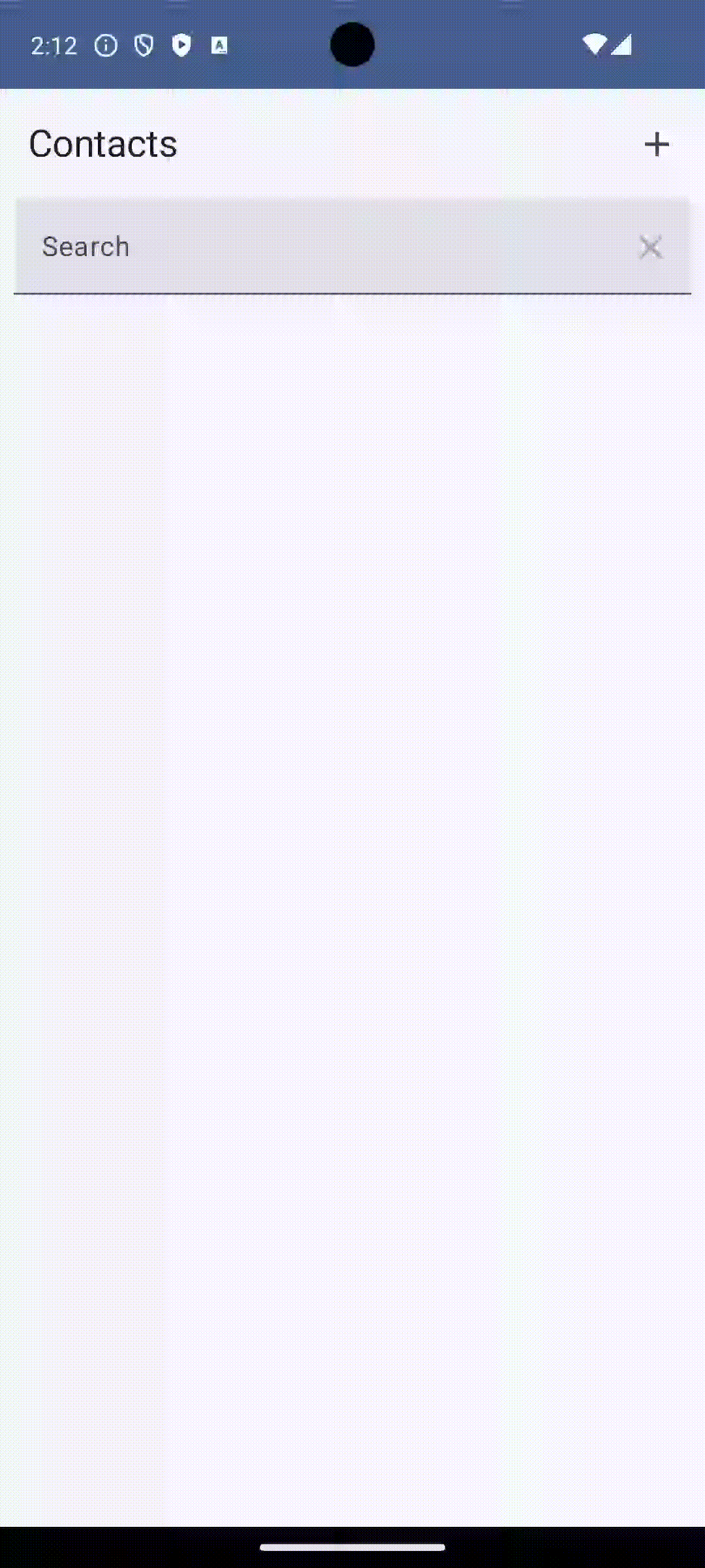
And here is what we want to make:
But first, we must update the library version catalog. In [versions] section add navigationRuntimeVersion = “2.7.7” and in [libraries] section add
androidx-compose-navigation = { module = "androidx.navigation:navigation-compose", version.ref = "navigationRuntimeVersion" }In build.gradle.kts at app level in dependencies section add new dependency:
implementation(libs.androidx.compose.navigation)Now, let’s enhance the navigation experience in our MainActivity by incorporating slide animations. We’ll achieve this by defining custom animations within the navigation setup.
    @Composable
    fun NavigationView(navController: NavHostController) {

        val isLtr = LocalLayoutDirection.current == LayoutDirection.Ltr
        val slideTime = 300
        val slideInHorizontally =
            slideInHorizontally(initialOffsetX = { if (isLtr) it else -it }, animationSpec = tween(slideTime))
        val slideOutHorizontally =
            slideOutHorizontally(targetOffsetX = { if (isLtr) it else -it }, animationSpec = tween(slideTime))
Here’s a breakdown of the variables we’ll use to create the slide animations:
isLtr: This variable checks if the current language is read from Left-to-Right (like English). This is important because slide animations need to be reversed for Right-to-Left languages (like Arabic). We’ll use it to determine the direction of the slide animations.slideInHorizontally: This variable holds an animation definition that animates a screen sliding in from the side. We’ll customize this animation further to specify the starting position and duration.slideOutHorizontally: Similar toslideInHorizontally, this variable stores an animation for a screen sliding out in the opposite direction. Again, we’ll define the animation details to control the behavior.
By using separate variables for entering and exiting animations, you gain more control over the visual flow of your app’s navigation.
Now, let’s integrate the slide animations we defined earlier into our navigation setup. Updated code will look like this:
    @Composable
    fun NavigationView(navController: NavHostController) {
        val isLtr = LocalLayoutDirection.current == LayoutDirection.Ltr
        val slideTime = 300
        val slideInHorizontally =
            slideInHorizontally(initialOffsetX = { if (isLtr) it else -it }, animationSpec = tween(slideTime))
        val slideOutHorizontally =
            slideOutHorizontally(targetOffsetX = { if (isLtr) it else -it }, animationSpec = tween(slideTime))

        NavHost(
            navController = navController, startDestination = NavigationPath.CONTACTS_VIEW,
            enterTransition = { slideInHorizontally },
            exitTransition = { slideOutHorizontally },
        ) {
            composable(
                NavigationPath.CONTACTS_VIEW
            ) {
                ContactsView()
            }
            composable(NavigationPath.ADD_CONTACTS_VIEW,
                enterTransition = { slideInHorizontally },
                popEnterTransition = { null },
                popExitTransition = { slideOutHorizontally }) {
                AddContactView()
            }
            composable(
                NavigationPath.EDIT_CONTACT_VIEW_ID,
                arguments = listOf(navArgument(NavigationParams.CONTACT_ID) { type = NavType.IntType }),
                enterTransition = { slideInHorizontally },
                popEnterTransition = { null },
                popExitTransition = { slideOutHorizontally }
            ) {
                navController.currentBackStackEntry?.savedStateHandle?.set(
                    NavigationParams.CONTACT_ID,
                    navController.currentBackStackEntry?.arguments?.getInt(NavigationParams.CONTACT_ID)
                )
                EditContactView()
            }
        }
    }
And that is all what we need to change!
Composable function and parameters
Params:
route – route for the destination
arguments – list of arguments to associate with destination
deepLinks – list of deep links to associate with the destinations
enterTransition – callback to determine the destination’s enter transition
exitTransition – callback to determine the destination’s exit transition
popEnterTransition – callback to determine the destination’s popEnter transition
popExitTransition – callback to determine the destination’s popExit transition
content – composable for the destination
Understanding Navigation Transitions:
Jetpack Compose Navigation offers two sets of transition properties for animations:
enterTransition/exitTransition: These properties control the animations used when navigating forward to a new destination.enterTransition: Defines the animation for a screen entering the view hierarchy. This is typically used for animations like sliding in from the side or fading in.exitTransition: Defines the animation for the current screen being replaced as you navigate forward. This is often used for animations like sliding out or fading out.
popEnterTransition/popExitTransition: These properties dictate the animations used when navigating backward (popping) from a destination.popEnterTransition: Defines the animation for a screen re-entering the view hierarchy when navigating back to it. This can be used to create a seamless transition effect for returning screens.popExitTransition: Defines the animation for the screen being popped out of the navigation stack as you navigate back. This might be similar to theexitTransitionbut could also be customized for a distinct “backing out” feel.
Understanding Navigation Transitions in Action:
Imagine navigating from Screen1 to Screen2. Here’s a breakdown of the animations involved:
- Forward Navigation (Screen1 to Screen2):
exitTransition(on Screen1): This animation plays asScreen1exits the view hierarchy. This could be a slide-out animation or a fade-out animation, depending on your preferences.enterTransition(on Screen2): This animation plays asScreen2enters the view hierarchy. This is typically used for animations like sliding in or fading in.
- Backward Navigation (Back button pressed):
popEnterTransition(on Screen1): Since you’re navigating back toScreen1, this animation plays to showcase its re-entry into the view hierarchy. This might be the same animation used forenterTransitionfor a seamless return experience.popExitTransition(on Screen2): This animation plays asScreen2exits the view while navigating back. This could be similar to theexitTransitionbut could also be customized for a distinct “backing out” effect.
Simulating iOS-style Animation:
In our example, we focused only on enterTransition and popExitTransition to achieve an iOS-style animation. This approach effectively creates a similar feel to iOS navigation by emphasizing the screen transitions during navigation.
Key Takeaways:
- Both
enterTransition/exitTransitionandpopEnterTransition/popExitTransitioncan be used to create a rich and engaging navigation experience. - By understanding their purpose and customizing the animations, you can tailor your app’s navigation to match your desired user experience.