While Android tablets are seeing a resurgence in popularity, software support can vary depending on the manufacturer and device.
Many popular apps, like those from Meta (Facebook), Reddit and so on, lack proper optimization for Android tablets. This results in apps locked in portrait mode, inefficient use of screen space, and a stretched phone experience. It’s particularly frustrating when these same apps offer optimized layouts for the iPad despite using development frameworks like React Native that promote cross-platform compatibility. Developers could be doing more to ensure a seamless experience across all devices.
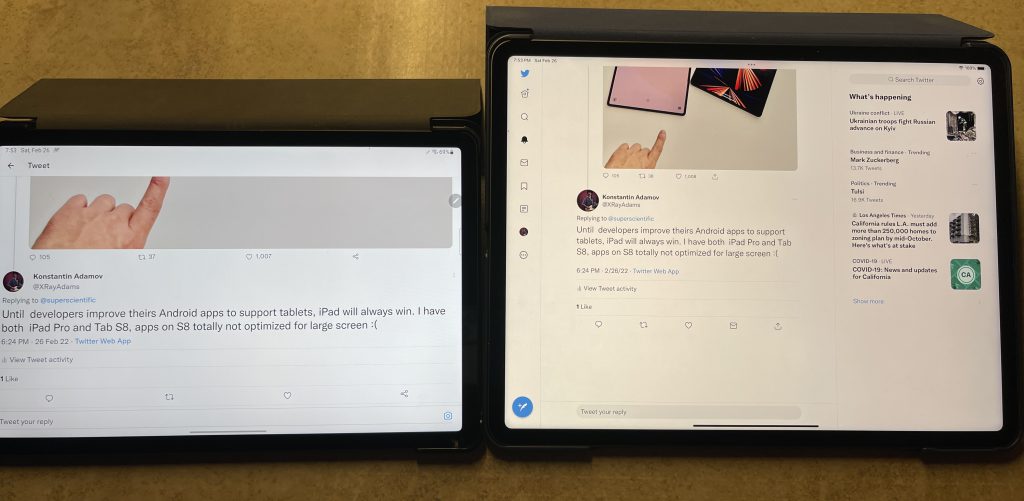
Remember how the Twitter app (now X) looked on Android tablets before? It’s come a long way in terms of functionality.
As a developer, I understand the importance of efficient resource allocation. For apps built with declarative UI frameworks, even basic optimizations like limiting content width on tablets can significantly improve the user experience.
Building on the Room DB Example project, let’s see how Jetpack Compose can be used to optimize the main screen for a tablet layout.
Here is a screenshot of preview of screen in a tablet mode.
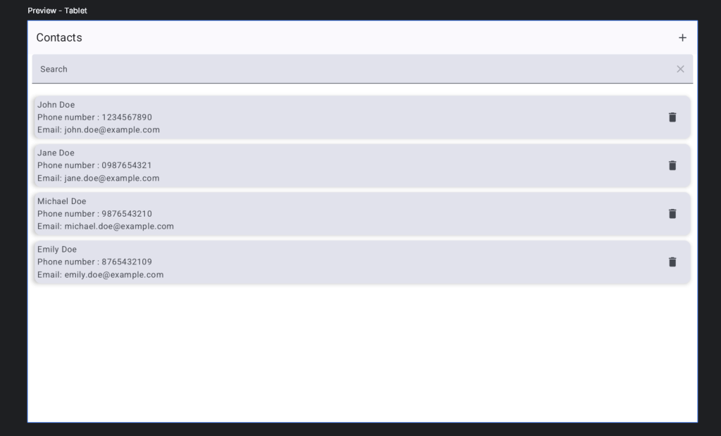
Currently, the UI elements are stretched across the entire tablet screen, which creates an inefficient layout. To improve this, we can consider applying width restrictions to two key elements:
Search Field
The search field, likely implemented using a TextField composable, resides in the ContactsView file.
        TextField(value = searchString,
            modifier = Modifier
                .fillMaxWidth()
                .padding(bottom = 10.dp, start = 8.dp, end = 8.dp),
            label = { Text(stringResource(R.string.txt_search)) },
            trailingIcon = {
                IconButton(
                    enabled = searchString.isNotBlank(),
                    onClick = { updateSearchString("") }) {
                    Icon(Icons.Default.Clear, contentDescription = stringResource(R.string.txt_clear))
                }
            },
            onValueChange = {
                updateSearchString(it)
            })
We should add widthIn and align into Modifier. Now TextField looks like this:
        TextField(value = searchString,
            modifier = Modifier
                .widthIn(max = 620.dp)
                .align(Alignment.CenterHorizontally)
                .fillMaxWidth()
                .padding(bottom = 10.dp, start = 8.dp, end = 8.dp),
            label = { Text(stringResource(R.string.txt_search)) },
            trailingIcon = {
                IconButton(
                    enabled = searchString.isNotBlank(),
                    onClick = { updateSearchString("") }) {
                    Icon(Icons.Default.Clear, contentDescription = stringResource(R.string.txt_clear))
                }
            },
            onValueChange = {
                updateSearchString(it)
            })
And preview looks like this:
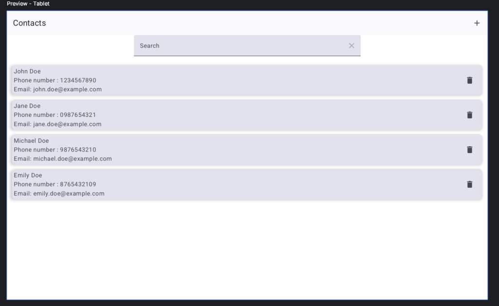
Much better-looking UI, do you agree?
List view.
Before:
        LazyColumn(
            horizontalAlignment = Alignment.CenterHorizontally,
            contentPadding = PaddingValues(8.dp),
            modifier = Modifier
                .fillMaxSize()
        ) {
and after:
        LazyColumn(
            horizontalAlignment = Alignment.CenterHorizontally,
            contentPadding = PaddingValues(8.dp),
            modifier = Modifier
                .widthIn(max = 620.dp)
                .align(Alignment.CenterHorizontally)
                .fillMaxSize()
        ) {
Result preview of this screen
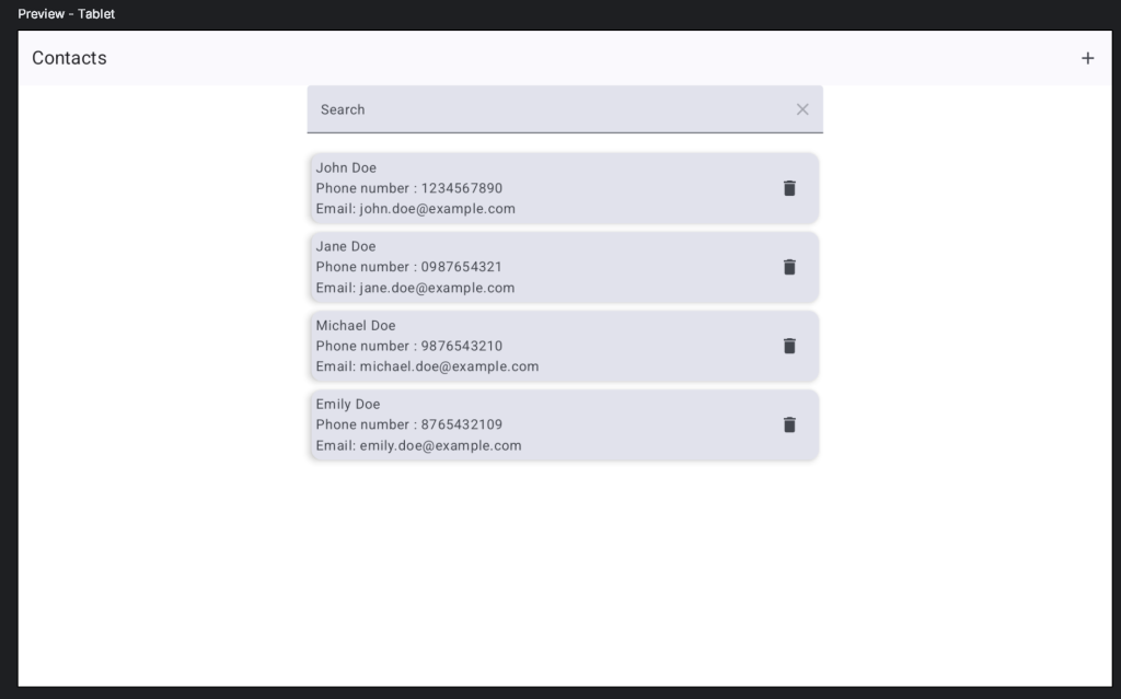
Great improvement! By restricting the width of the inner content, the UI takes full advantage of the tablet screen real estate while maintaining a visually appealing layout. This simple optimization eliminates the need for a portrait-only mode, offering a more versatile user experience on tablets.
If your layout only uses a single Column widget, you can’t directly apply the .align modifier to control its child alignment.
Here’s a workaround: Wrap your existing Column within another Column. This allows you to set the horizontalAlignment property on the outer Column to achieve the desired alignment for its child elements.
Column(horizontalAlignment = Alignment.CenterHorizontally) {
        Column(
            modifier = Modifier
                .widthIn(max = 620.dp)
                .fillMaxSize()
        ) {
This is screenshot of Edit contact screen
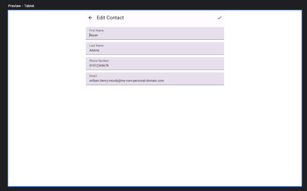
For an exceptional tablet experience, consider leveraging the extra screen real estate with UI elements like a Rail Navigation component. While this approach requires more UI and code modifications, it can significantly enhance the user experience on tablets.
Official Google documentation to support different screen size available here: Support different screen sizes | Jetpack Compose | Android Developers